
The InfoChemist | Research Tools
How Ahmad Arsalan Is Bringing Journal Impact Factors Straight to Google Scholar (Impact Factor Finder)
Computer scientist Ahmad Arsalan built Impact Factor Finder to end the tab-switching ritual of looking up a journal’s impact factor one paper at a time, and he is candid that the numbers behind it are compiled from public sources rather than licensed from an official database.
Written by Atir Naeem Qurashi | Published September 15, 2026 | 7 min read | Category: Research Tools
Anyone who has updated a CV, reviewed a colleague’s publication list, or prepared a grant application knows the drill. You open a Google Scholar profile, click through to a journal’s website, search for its impact factor, note it down, and go back to do the same thing for the next paper on the list. Multiply that by a career’s worth of publications and it becomes hours of repetitive, easily-botched work.
Ahmad Arsalan, a computer scientist and Senior Lecturer at the University of Central Punjab in Lahore, got tired of that cycle and built a browser extension to fix it. Impact Factor Finder overlays a journal’s impact factor and quartile ranking directly onto a Google Scholar profile, next to each paper, with no extra tabs required. Since launch it has picked up more than 9,000 users and a 4.6 out of 5 rating on the Chrome Web Store.
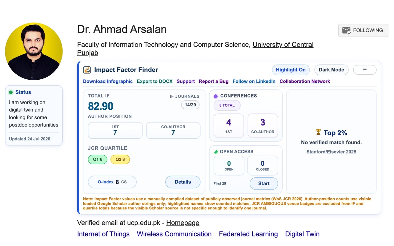
Impact Factor values use a manually compiled dataset of publicly observed journal metrics.
From tab-switching to one click
“Researchers should not have to open multiple tabs just to understand the journals behind a publication list,” Arsalan said. “The impact factor and related information should appear directly where researchers are already viewing their work.” That idea, born from his own frustration reviewing Scholar profiles and CVs, became the starting point for the extension.
When it runs on a Scholar profile, Impact Factor Finder reads the publication list on the page and identifies the journal or venue behind each entry. Behind the scenes, it cleans and standardizes journal names, a bigger job than it sounds, since the same journal might appear as a full title, an abbreviation, an old name, or a translated title, while entirely different journals can carry near-identical names. Once it finds a confident match, it displays the impact factor and quartile beside the paper, and rolls the results up into profile-level stats: total impact factor, highest-impact journal, quartile distribution, author-position breakdowns, and other summary indicators. When a journal name is too ambiguous to match reliably, Arsalan said the extension is built to hold back rather than guess and risk showing an incorrect number.
The hardest part was never the interface
Arsalan pointed to journal-name matching as the toughest technical problem, not because any one case is hard, but because academic publishing is inconsistent at scale. He addressed it with what he calls a layered matching process: normalizing names, checking known aliases and abbreviations, stripping irrelevant text, and applying conservative validation before anything gets displayed. On top of that, Google Scholar loads its pages dynamically, so the extension also has to track what has already loaded, avoid processing the same publication twice, and keep results accurate as more of the page appears.
From colored badges to a CV-ready document
Two of the extension’s most popular features exist for a very practical reason: researchers don’t just want to see their metrics, they need to hand them to someone else. The profile infographic turns a Scholar page into a shareable, presentation-ready snapshot, citations, impact-factor data, quartiles, publication categories, and author positions condensed into one image. The DOCX export goes a step further, generating an editable document a researcher can adapt directly into a CV, grant application, or institutional report instead of retyping journal information by hand.
Arsalan built both for a wide range of users, from graduate students sizing up a supervisor’s publication record before submitting their own paper, to principal investigators reviewing a lab’s collective output, to hiring committees and research administrators. “The goal is not to reduce research quality to a single metric,” he said. “It is to make commonly used publication information easier to access while keeping the broader research record visible.”
What a stressed grad student sees first
Picture a first-year graduate student, minutes from a submission deadline, frantically searching “journal impact factor” across a dozen browser tabs. Arsalan said the reassurance comes from where the information appears: right beside the actual publication, in the context of a real researcher’s profile, rather than scattered across databases and unofficial websites. Color-coded quartile badges do the rest, turning a number that usually needs interpretation into something readable at a glance. Even so, he was quick to add a caveat of his own: journal choice should still weigh scope, peer-review quality, indexing, publication ethics, audience, and review times, not impact factor alone.
For a first-time user, his advice is simple: open your own Scholar profile and generate the infographic. It gives an immediate, consolidated view of publication venues, quartiles, citations, and authorship positions in one place, exportable for sharing or for a CV.
Where the numbers actually come from
Because the extension displays impact factors and quartile rankings, and because Journal Impact Factor is a metric proprietary to Clarivate’s Journal Citation Reports, we asked Arsalan directly where his figures originate, how current they are, and whether the extension holds any license to redistribute them.
His answer, in full: the metrics shown in Impact Factor Finder are compiled from publicly available information published by journals and other publicly accessible sources, not pulled from an official Clarivate, Scopus, or CiteScore feed under license. Because different journals update their own published figures on different schedules, the dataset does not reflect a single uniform reference year across every entry, and it is refreshed periodically rather than on a fixed cycle. Arsalan was clear that the tool “does not claim to be an official source for journal metrics” and is intended as a convenient reference rather than an authoritative record, with users encouraged to verify any figure through the relevant official provider before relying on it for submission, evaluation, or institutional decisions.
That distinction matters for anyone using the extension for something formal. A quartile badge that helps you sanity-check a journal while browsing is a different thing from a number you would cite in a grant file or a tenure packet, and Arsalan’s own answer draws that line clearly. Worth keeping in mind if you use the tool for anything beyond a quick reference.
Build for the problem you actually have
Asked what habit other researchers might borrow from how he works, Arsalan didn’t point to a framework or a methodology. “Build solutions around problems you repeatedly experience yourself,” he said. Impact Factor Finder started as a small, personal frustration, not an attempt to build a platform. He built a simple fix, used it himself, shared it, and improved it feature by feature based on feedback. His broader point: researchers routinely accept inefficient, repetitive processes as normal, when pausing to ask whether a task can be simplified or automated can turn a small script into something a much wider community ends up using.
What’s next
Arsalan said the roadmap is shaped directly by user feedback. Near-term priorities include richer collaboration analysis, with improved co-authorship network visualizations and better ways to see international and institutional collaboration patterns, alongside stronger filtering and sorting, more detailed profile analytics, and additional export formats. He’s also focused on the less visible work of improving accessibility, performance, and matching accuracy before adding new features on top.
Longer term, he described Impact Factor Finder evolving from a metrics overlay into a broader research-profile assistant, potentially through partnerships with universities, research-support offices, and organizations that help researchers with careers and scholarly visibility. He was careful to frame the goal narrowly, though: a set of tools that reduce repetitive academic work, not a system that judges research quality by numbers alone.
Fast Facts
- PhD in Computer Science, COMSATS University Islamabad, dissertation on Digital Twin-Assisted Mobile Edge Cloud Networks
- Senior Lecturer, Faculty of Information Technology and Computer Science, University of Central Punjab, Lahore
- Founder, Center for Emerging Network Technologies (CENT) Lab
- Postdoctoral researcher, Zhejiang A&F University (2025-2026)
- Creator of Impact Factor Finder (9,000+ users, 4.6/5 on the Chrome Web Store) and ScholarBlink
- Research interests: digital twins, UAV-assisted mobile edge computing, federated and deep reinforcement learning, IoT, next-generation internet architectures, smart cities
Explore More at InfoChemist
Interested in how AI is accelerating the design of next-generation sensing materials? Read our analysis on AI in Chemistry to see how machine learning is transforming analytical chemistry from the molecular level up.
